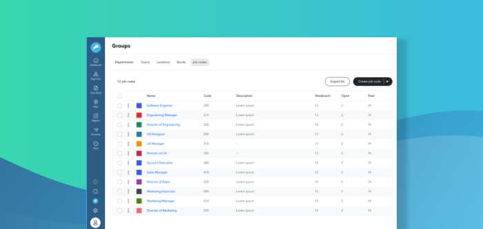
Analyzing HR data across multiple systems - from an HRIS to an ATS to an equity management system - is a core part of the ChartHop platform. The latest update to ChartHop introduces more intuitive controls and visually-appealing charts to improve how you build reports and analyze your people data.
Create Charts on HR and People Data Faster
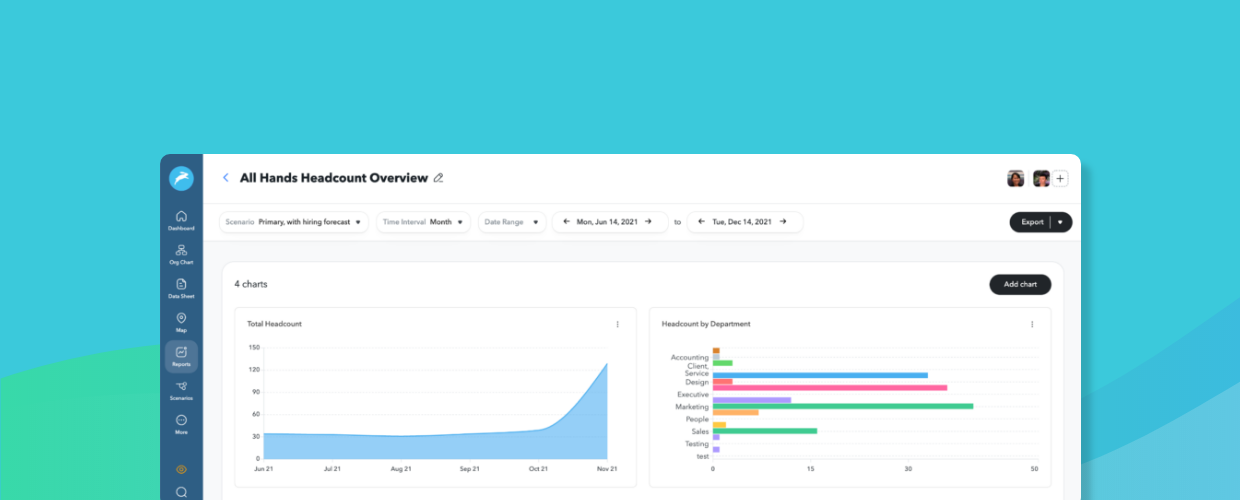
A more user-friendly report builder means you can spend even less time building reports.
With the new design, you can quickly build charts to measure DEI, compensation, headcount, and much more. Using the toolbar on the right side of a chart, you can change which data points you want to compare and how you visualize that data, with formats such as bar graph, table, pie chart, area graph, and more. For example, you could easily measure headcount by location, headcount by department, headcount by gender, or any other variables you have in your system.

We’ve also introduced easy-to-use filters so you can quickly narrow in on specific areas of your organization. Whether it’s zoning in on only full-time vs. part-time employees, managers, specific departments, performance ratings, or a combination of all of the above, you can quickly check the boxes and add constraints to create the reports you need.

Improve Visibility Into Who Has Access to Which Reports
Finally, we’ve increased visibility into who is shared on each report. Now, a single table view shows you which reports are available to the entire org, the sensitivity of the data, and who has shared access to the reports – plus you can even sort based on each of those factors.

As always, you can continue to alter who can edit the report and who can view it, whether it’s the whole org or a subset of people.

How to Get Started
Ready to see the latest updates in action? To access the new reports and start building beautiful charts of your people data, simply click “Reports” in the left-hand nav bar in ChartHop. For even more insights about how to use the new reports, click here.